You are currently browsing mgorteka’s articles.
So, I have been in somewhat confused state lately. Since the semester is coming to an end, I am preparing my final capstone document; framing and re-framing things so that it makes sense to Eli and people who might read it.The journey of capstone is organic, the research phase never ends technically. But for presenting the project, I need to break things down , more specifically in PRInCiPleS format for the final deliverable.
Jeff shared an amazing framework of ‘What, How and Why’ to think about a paper or a design project. It totally made sense to me. I documented my capstone thought process in that flow. But as I was presenting it to Eli, I felt I was struggling a little bit. So, I mapped these two frameworks to understand how can they be related and came up with this: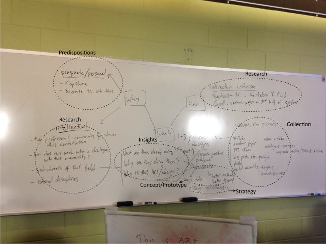
What do you guys think ? How are you bridging this gap between documenting a process and presenting it? Would really appreciate some feedback..
I must admit todays reading ‘The later features: The double life of Veronique’ was one of the most engaging readings I have done for this class. The verbal richness describing the character, her experiences and intricate details of her feelings and conflicts blew my mind. I watched the film first and then did the reading. As I was reading, the entire film flashed through my mind subtly pointing out the scene details and connections between them. Elliot W. Eisner describes criticism as ‘the art of disclosure’. In his article ‘Connoisseurship, criticism and the art of education, he quotes Dewey – ‘Criticism, as Dewey pointed out in Art as Experience, has at is end the re-education of perception… The task of the critic is to help us to see.’ I believe this nature of criticism of the film ‘The double life of Veronique’ was very well done by Kickasola. ( Though I didn’t get all his points, I experienced some ‘ah-ha’ moments while I was reading).
Another thing that struck me was the subtleness of the clues in cinematic techniques and narration that contributed to the film experience. In designing user experiences, I believe we can take some inspiration from Kieslowski by making careful and subtle choices regarding design elements. For a ‘happy’ experience, the design need not scream ‘and now it’s time to be happy’ (hopefully this makes sense). The point I am making is by downplaying some elements or giving indirect clues, designers can craft more meaningful and deep experiences that can have a lasting impression on people.
What
‘Film instances as a rhetorical devices to explore social and cultural issues with a technology.’
This is inspired from Pastiche scenarios that draws on fiction as a resource to explore the interior ‘felt life’ aspects of
User experience and complex social and cultural issues raised by technological innovations. There is a detailed and very interesting paper written by Mark A. Blythe and Peter C. Wright on the topic ‘ Pastiche scenarios: Fiction as a resource for user centered design’.
Pastiche scenarios as described in the paper can be generated by ‘ cutting and pasting lines of source text and then modifying the story line to allow for the introduction of the technology in question.’ For my final paper, since I am focusing on films which is rich media in terms of visuals, I have decided to use film instances (screen shot of film scenes) to explore the social and cultural issues. I am not sure if these instances can be called as pastiche scenarios.
Also, I have picked ‘Indian films’ as a case study for my capstone (final paper is derived from it) and I am choosing films based on Mumbai culture, specifically those scenes that I believe have captured the context and cultural specificity very well. (I am placing myself as a strong subject in this.)
Why
- Films meant more to me than a just another source of entertainment. I feel deeply moved after watch some of the Indian films mostly due to the richness of context portrayed in it. It’s the groundedness of these films, story lines, music and actors acting in it that left a long lasting impression on me. I knew I had to do something about it in my capstone.
- Almost in all of my RDSC projects, I have used stories to communicate design. These story, I felt, weren’t very rich. Of course , user experience designers are not graphic artists but I thought we could still stretch our imagination to think about different ways a technology could be used/adapted by people considering different social and cultural context during ideation.
- Expansion of third wave HCI that stretched beyond workplace and started considering user experience holistically.
One of the quotes from ‘Critical and cultural approaches to HCI’ paper from Jeffery Bardzell –
‘Cultural HCI should have less to do with telling us about culture and more to do with helping us improve culture. It would be wrong, I argue, to see cultural approaches primarily as another research lens to tell us what is out there in the world; the social sciences are a better fit for this direction of inquiry. Cultural approaches should be used to help HCI improve our lived environment and improve ourselves.
Prior work/sub-domain of HCI
My research and audience group is hugely influenced by these two papers
- ‘Pastiche scenarios: Fiction as a resource for user centered design ‘ by Mark A. Blythe *, Peter C. Wright
In this paper, pastiche scenarios have been used to for three purposes and explained in details by three interesting case studies:
- Pastiche scenarios are used to explore ‘felt-life’ issues.
- Pastiche scenarios are particularly valuable in participatory design situations, since they engage users in the way that characters in novels might.
- pastiche scenarios can be used to explore social and cultural issues with imagined technology.
I am more interested in exploring the third purpose and appropriate it by using films.
- Design Documentaries: Inspiring Design Research Through Documentary Film by Bas Raijmakers, William W. Gaver, Jon Bishay
I liked how they started. Their approach really helped me articulate why I chose ‘films’ as a medium to understand and explore cultural and social issues.
One specific quote that resonated the most with me –
” We suggest that, for design research in HCI, film can be much more than a note-taking tool; we can use it as a means to explore, understand and present the everyday, and benefit from film’s capabilities to preserve ambiguities and paradoxes instead of resolving them into univocal conclusions.”
How
I am planning to make a card deck of film instances and conduct a small activity of ideating and exploring different possible technological solutions.
My intention is to help designers empathize with and consider different cultural and social issues that could shape the usage of the technology they design.
” It is possible for designers to shape how technology is used but not to determine it.” – Mark A. Blythe and Peter C. Wright in ‘ Pastiche scenarios: Fiction as a resource for user centered design’.
Besides these, few papers that I am planning to refer are:
- Critical And Cultural Approaches To HCI by Jeffery Bardzell
- ‘‘A great and troubling beauty’’: cognitive speculation and ubiquitous computing Jeffrey Bardzell, Shaowen Bardzell
- Interaction criticism: An introduction to the practice Jeffrey Bardzell
- MACHINIMATIC REALISM: CAPTURING AND PRESENTING THE “REAL WORLD” OF VIDEO GAMES Jeffrey Bardzell
- Cinema and touch
- Crafting User Experiences by Incorporating Dramaturgical Techniques of Storytelling
- A User-Centric Adaptive Story Architecture – Borrowing from Acting Theories
- Carroll
- Elliot W. Eisner, connoisseurship, criticism and the art of education
These are some of the collection I have. I am going to refer readings from Foundations, Experience design and Interaction culture paper.
If you have some advice on the paper, or suggestions, or critique, I will be happy to receive it .. 🙂
While reading “Cinema as skin and touch” two quotes resonated the most with me.
” In LA., nobody touches you. We’re always behind this metal and glass. I think we miss that touch so much that we crash into each other , just so we can feel something.” (Pg.1)
This quote suggested the lack of utilizing ‘touch’ sensory, especially in today’s technology. We touch things to feel things. It adds to our perception and the process of sense making.
“The idea of haptic perception, according to which the eyes function as organs of touch, letting what she calls haptic images appeal to a more complex multi-sensory perception.” (Pg. 9)
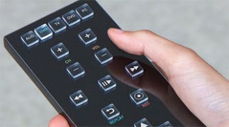
Based on this concept of ‘haptic perception’, a company from California has developed a technology in which the physical buttons come out of the touch screen for people to have the dimension of materiality and feel it while operating technology. Now, I am not entire sure how these buttons come out but from the pictures below it seems like they are utilizing haptic perception by giving 3D effect to buttons on the screen.
According to the CEO of the company, “As human being we really want to be able to feel things. We want tactility”.
URL: http://www.medgadget.com/2012/06/tactus-redefines-meaning-of-touchscreen-blind-folks-have-reason-to-rejoice.html
Though this type of technology is still in its conceptual stage, I am excited and curious to know what might be its future. More and more people want to return to their old phones with buttons as they get to feel them while operating.
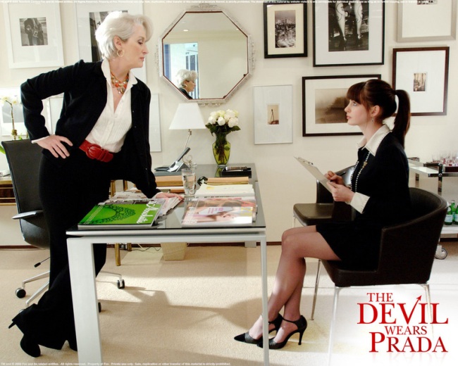
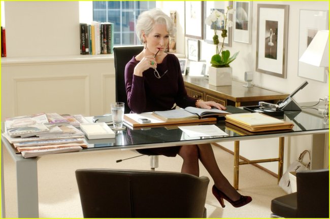
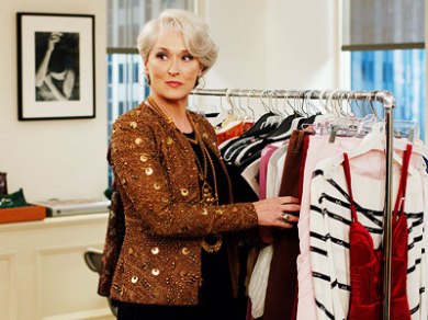
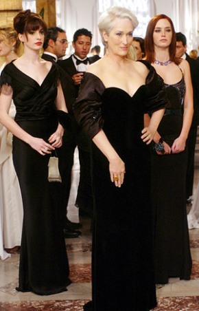
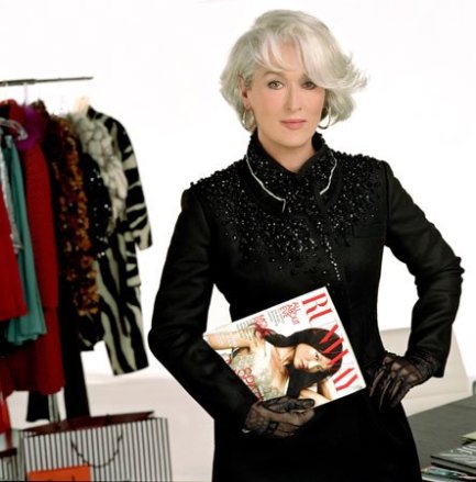
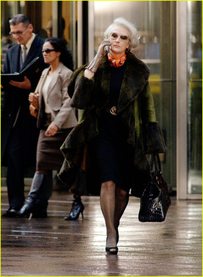
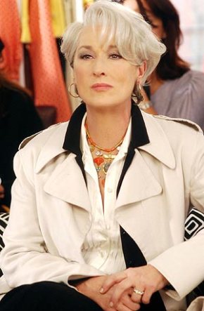
When I was reading about Power dressing and Technology of self by Joanne Entwistle today, I made connections to Meryl Streep’s character Miranda Priestly from the film – Devil wears Prada (released in 2006). Miranda Priestly is a fashion magazine editor and known to be one the most powerful women in the city .
I too, felt the need of visual examples in the reading in terms of understanding how “the so-called career women dresses for work” more clearly and therefore, I collected these images for analysis.
From the reading, as stated by Armstrong:
” The power dressing phenomenon of the 1980’s defined the style of female professional garb which typically consisted of tailored skirt suit with shoulder pads, in grey blue or navy, accessorized with the ‘token female garb such as bows and discreet jewellery .”
Looking at the pictures above, we can definitely see the style of female professional garb has changed from 1980’s to 2000’s .. Women are no longer sticking only to tailored skirts though shoulder pads is still exists. Also, the black theme persist prominently… Any thought on this???
This is just an attempt to understand similarities and differences between aesthetics of arts and aesthetics of design. Inspired from Folkmann’s ideas and views on aesthetics, I am trying to apply his framework to design and art examples. I don’t really have a specific conclusion. I am just developing my own understanding and would really appreciate discussion on this topic. The structure of this blog is a series of question-answers (sort of an internal conversation that is taking place in my mind as I am writing).
Why is aesthetics important?
According to me, aesthetics is what makes us human. It increases our questioning and reasoning capability. It makes us aware of the fine line between good and bad (?).Traditionally, it comes together with art and is almost impossible to separate them.
Then why is it so important to design? Because aesthetics is an entry point to our basic access of experience. It gives an emotional value to design.
Difference between art and design:
Design is motivated by some purpose. It has a specific target user group. Sometimes “functionality” has a higher precedence over “aesthetics”. Art need not have the dimension of “functionality”. It can be just an expression of a lone artist or portrayal of personal feelings or just a mere form of an entertainment and enjoyment.
Similarities between aesthetics in art and aesthetics in design:
Aesthetics is an integral element of art and design. It is relational, depends on the subject and object. An object can be aesthetically coded by a designer/artist and perceived with equal rigor by a user/observer having aesthetic perception. The approach to investigate aesthetics in art and design can be same.
In the following section, I will apply Folkmann’s framework to art and design examples to understand similarities in aesthetics between the two fields.
1. Sensual – phenomenological platform
Both Art and Design can have a specific form and appearance that mediates aesthetic communication between the artist/designer and the observer/user that challenges experience and understanding of things.
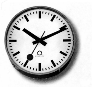
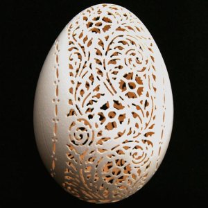
Railway clock (Fig. 3.1, Aesthetics) Eggshell sculpting (http://www.disassociated.com/2013/01/17/)
In the first example, railway clock is a design that has a definite form and appearance. It is functional yet it challenges our understanding of the concept ‘time’. In a way, railway clock can be considered a ‘critical design’ – Usable but not useful (?).
In the second example, Eggshell sculpting is an art which is clearly not usable but it manages to challenge our understanding of eggshells through its form and appearance.
2. Conceptual- Hermeneutical platform
Both Art and Design can be staged. As per Folkmann “a design reflects the meaning through its actual presence and unfolding in a physical setting by means of sensual aspects of forms, materials and color”.
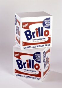
Classic example that we have recently studied is ‘Brillo boxes’. One of the reasons Brillo boxes became such a successful design is because of its staging (as seen in the picture). There was a lot of discussion on the nature of its staging in the class. Thus there were certain aesthetic elements associated with the way Brillo boxes were presented to the public (White background, Fancy photography techniques, placements, etc).
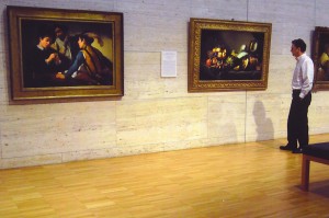
Brillo box (sfmoma.org/explore/collection/artwork) Paintings in a museum (muddycolors.blogspot.com/2012archive.html)
The other image here is that of paintings in a museum. Their arrangements and ambience adds a layer of aesthetic coding to the environment. Paintings, as a piece of art, are thoughtfully presented in a way that they themselves seem to be wanting to perceive aesthetically by subjects.
3. Contextual – Discursive Platform (Aestheticization)
This platform constitutes distribution of aesthetics in everyday life. As pointed out by Folkmann, “aesthetics has its capacity for creating and construing meaning on the level of society”. It is ubiquitous and non circumventable.
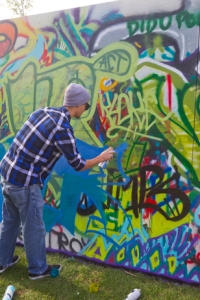
Coke neon signs (http://www.flickr.com/photos/sfcabbie/) Graffiti public art (homepages.indiana.edu/web/.html)
Coca-Cola neon signs have an effect on the cityscape and emit messages of desire and hope. It speaks to the desires of people that can never be fulfilled (enjoyment). Therefore, aesthetics has ethical implications similar to design. Like design, aesthetics are political and biased. They define environmental ecology and hence boundaries of understanding and meaning making for people.
The image to the right constitutes a street graffiti in Bloomington. Graffiti is slowly becoming an upcoming public art form that adds aesthetics to the environment. They are unavoidable as they uses public space and therefore becomes a part of everyday life of local people.
Thus (as per my understanding), the role of aesthetics played in design and art is more or less the same. Aesthetics becomes the highest priority in both the fields. (Tractinsky offered evidences that, in HCI, usability and aesthetics are not in conflict –one of the strengths of aesthetic processing theory in HCI).
So, where is the difference? Why is it not possible to appropriate design by aesthetics of art? Why can’t we define essence of aesthetics in art and apply it to design?
The difference, according to Folkmann, is the fact that design aesthetics have additional parameters of being functional, informational and contextual. Also design is not an expression of an artist but rather the result of complex commercial and societal process.
Here is where, for me, the lines between aesthetics in design and art gets blur. In my opinion, there can be the same parameters (functional, informational and contextual) in art field. May be they are not so prominent. May be they are … I don’t know ..




Recent Comments